TUTORIAL 4: ACRYLIC PAINTING: Christmas Painting

Christmas Celebration

As the Christmas Bells are ringing and we all are all set to welcome the Festive Season of Christmas together.Here, is an easy to do Acrylic Painting of Christmas decorations without which this festival is incomplete.Hope you enjoy the process and have a wonderful month of Christmas with your near and dear ones.Merry Christmas too all of you.

As the festive season is round the corner, here I am with an easy Christmas Painting to put on your beautifully decorated Wall.

ART SUPPLIES USED ARE AS FOLLOWS :

* Windsor and Newton Acrylic colors.

*Acrylic Color Brushes.

*Gresso primer

*Canvas 6” *6”.

**Drawing Christmas Celebration step by step ** 

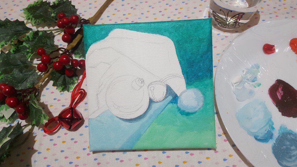
Lets get started with Painting then , so firstly we will be applying the Gresso white primer uniformly to your canvas and leave to dry completely .

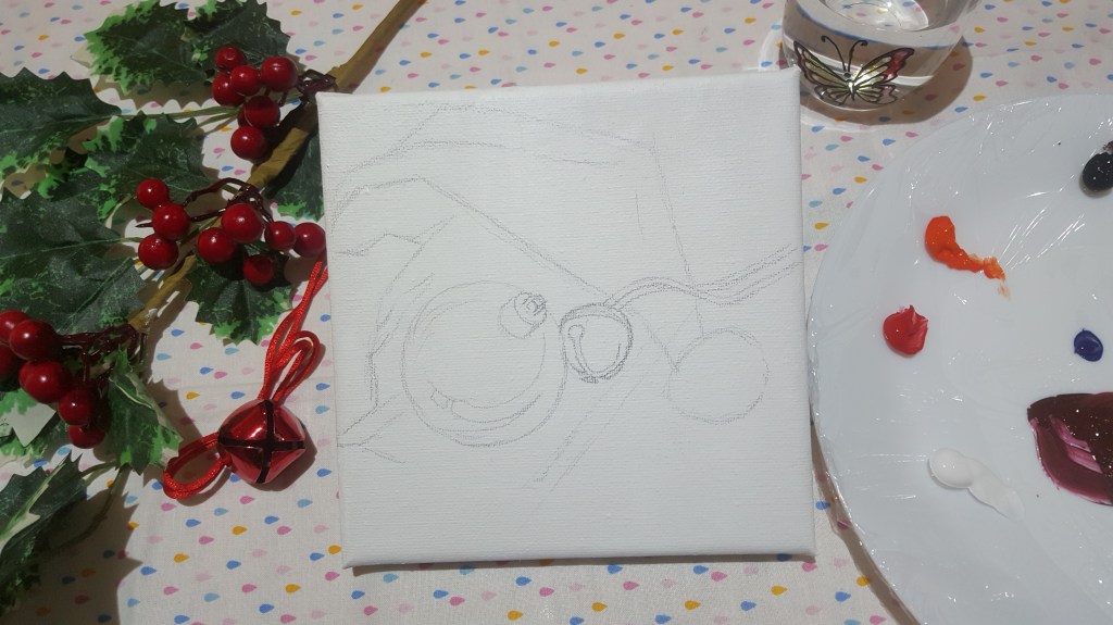
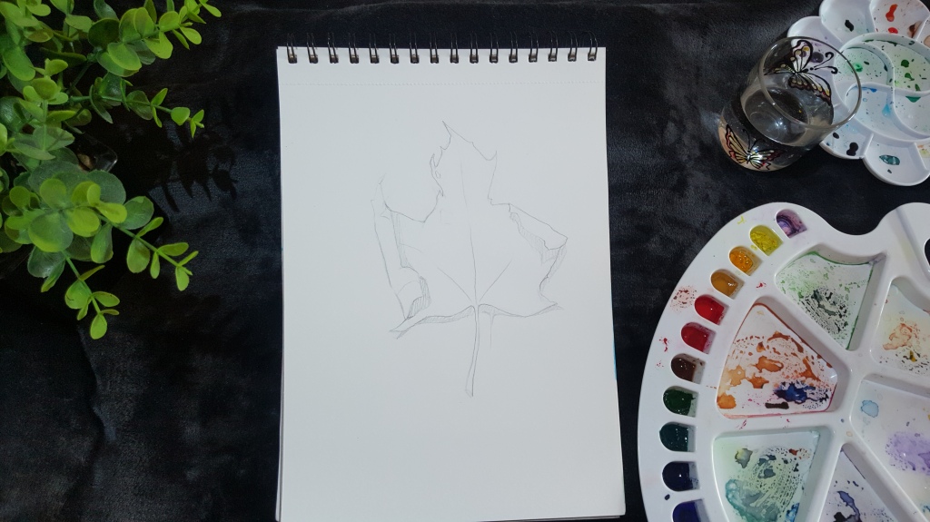
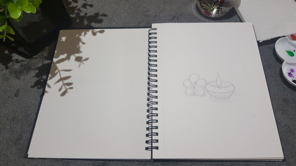
After which now we can start the drawing of our objects in the painting. The objects have easy shape so please refer to the picture above and draw it lightly with help of a pencil.

Moving ahead now as we know the objects are in place and we know their boundaries so lets start with painting with acrylic colors .

Firstly lets color the bottom ground , I have used sap green color here and lightly added the persian blue color to give it a darker tone . In order to make it look uniform and in darker tone I have given 2-3 layers of the same which helps the area stand out.

*Moving ahead to festive Christmas Cap , we start with doing the fur border and the soft ball at its end for which ,I have used white color along with a hint of Persian blue color to it.The main point to keep in mind here is that you must understand the fur nature of the border and try and elevate it to give the texture feel . I know initially it may be a little difficult but as we say practice makes it perfect and trying it is the first step towards it.

*After which we start with the top part of the cap using the red color .Here ,there are two parts where the tone of color is dark due to shadow and other part is bright. For the shadow part, I have used Red color with a hint of Persian blue and black color.For the bright part I have used a hint of orange mixed with the red color. As you paint remember the folds of the cap ,as it will give us the impact of the object and how they are arranged. Wherever the cap has folds try and merge the colors to show the transition.

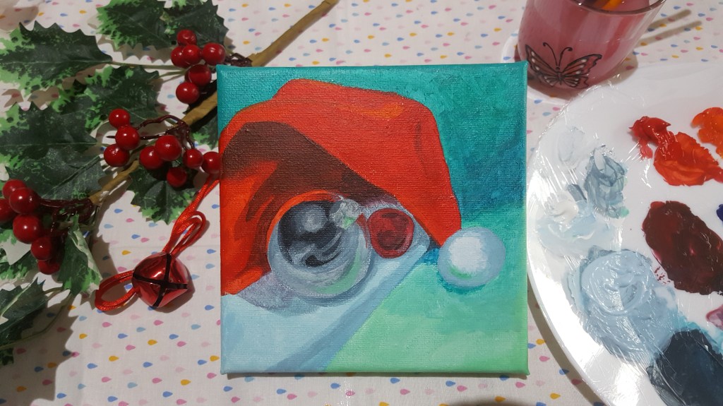
*Our next object is the metallic ball ,this object has many layers to take care of , like the reflection,shades/tones and its position the way it is placed on the cap and its round shape.Here to show reflections a grey color shade is used along with hint of black and white .The merging of different shades is playing a very important role in showcasing the light reflections in the painting.

*Our last object in the painting is the small bell. Here ,the color given to the bell is red color along with change of tones where reflection and depth is observed .Like, the reflection has been shown by using a hint of white and the depth inside the bell as well as the shadow portion is shown by the black color .The merging of colors and the highlights play an important role in the painting so that is a technique you can learn here using these small objects.

Hope you all enjoyed the Christmas Acrylic Painting ,and will try your hand at it without thinking how will it end up looking because anything when done with passion and dedication always shines and looks beautiful.

TUTORIAL 3: WATERCOLOR PAINTING: AUTUMN LEAF

AUTUMN LEAF

As the seasons change from hot summers to blissful rains and the through the beautiful foliage of autumn to the chilled winters. All of them have its own charm and beauty , leaving us mesmerized with its wonder .Today, we are going to learn a watercolor painting of a simple autumn leaf ,a leaf with beautiful combination of colors folding into one another.

So, friends lets make this beautiful but simple watercolor painting celebrating the season of Autumn as it passes by keeping us wondering about the beautiful creations by our Almighty.

ART SUPPLIES USED ARE AS FOLLOWS :

* Windsor and Newton Watercolors.

*Round Graduate Daler Rowney Brushes.

*Camel Photo Ink

*Handmade Paper / 220GSM watercolor sketch book.

**Drawing AUTUMN LEAF step by step ** 

Lets begin drawing the sketch first, as shown in the fig above , draw the sketch on your paper . Always try keeping the sketch as light tone as possible since we are using watercolors.While sketching understand the source of light and the leaf folds so that you know where you need to add dark or light tones to depict shadows.

As, shown in the figure ,now start your first wash of watercolors . I am using transparent photo ink colors as i like the vibrancy it gives to the painting ,you may also use regular colors for the same.Starting from the top , I have started with green color wash with approximately 10% color and 90% water.As you proceed downwards start adding orange,blue,red and yellow color.Since the wash contains more of water content it will be easy to mix colors as they flow downwards.After which now I turn towards the area of high tone or where you need to show shadow (bending of leaf ) ,here i have used persian blue color .

Let this first wash dry completely and then proceed second wash ,if you do not have patience use a hair drier for the same .

Moving ahead after the first wash has dried completely ,now we have to use more of color than water we used earlier .Always try and play with colors to get the right shade you desire ,as that is how you learn to get to understand your color palette in detail (always note down the color combinations or prepare a color chart for your reference later).Just enjoy and try different shades of colors for your autumn leaf . Start adding some green color from top and drag your brush down and repeat the colors you added in your previous wash slowly .Add a darker tone of persian blue to your parts of leaf showing shadow so it gets a darker tone. for the stem please use a thinner brush and steady hand add color to the stem( if little nervous that the colors will mix ,first complete the lighter tone part let it dry and then do the remaining part).

Moving on to the last layer ,i have just added the same shades in similar manner just varying the color to water ratio on the brush (so I have taken more of color and less of water ) to enhance the color of the painting to darker tone. Remember to add small details of folds and shadows to make it look more realistic. And that gives you a beautiful Autumn Leaf .

Always give a try in the hope of learning new details as you practice .Everyone has a different way of using colors and adding effect .So enjoy painting and refresh yourself by doing what you love …

TUTORIAL 1: ACRYLIC PAINTING

KARVA-CHAUTH SPECIAL # STEP BY STEP TUTORIAL # TRADITION

**ESSENTIAL SUPPLIES NEEDED ARE AS FOLLOWS,

1. MOUNT BOARD/CANVAS/WOOD BOARD

2. A3 ACRYLIC PAPER            

3. GESSO PRIMER WHITE

4. MASKING TAPE

5. ACRYLIC COLOR SUITABLE BRUSHES

6. WINDSOR AND NEWTON GALERIA ACRYLIC COLORS

As the painting is to be done in acrylic medium, its always important to have all your materials handy by your side as this medium dries faster than any other medium and you may face problem there.

Now to give the base of canvas an uniform surface we have painted the whole base with primer mentioned above .Remember please apply it in an uniform manner or you will have uneven surface for painting.

As you can see then I have first drawn a sketch with the help of a pencil and scale, you can now also consider the places of highlights you need to add later as you paint.

In this painting few layers are required and is quite simple to make if you follow the steps right.

#TIP: You may use very little water if your paint seems to dry fast.

At first we start with the larger portion of sari, which is going to be in cadmium red colour. So, gradually paint the sari with your brush and let it be a uniform coat you may need multiple coats to make it uniform. After which the yellow ochre colour and paint the border of the red sari in the same manner.

APPLICATION OF PRIMER
PENCIL SKETCH OF THE PAINTING

After which now slowly use cadmium orange to give highlights on the folds as shown in the picture below.

STARTING WITH RED AND THEN GIVING HIGHLIGHTS WITH ORANGE.

Now, turning to our background I have used Persian blue after giving a coat of it I have also induced violet colour in it to add depth .Remember the first layer will not give a final output as required as you finish your second layer you will see the painting coming out with all its objects in place.

BACKGROUND COLOR BLUE

In order to add the shadow of the red sari on the blue background I have used blue and hint of black mixed together and used it to give a darker tone. Similarly, the folds of red sari were also given the darker tone by using red and hint of black in it.Also ahint of blue is added to the edges of the sari to give a feel of reflection of the underlying blue sari,this also helps giving a realistic feel of the overall composition of the painting.

This is very important as it gives us an idea as to which object is placed where, like in this case it’s the red sari kept over the blue one.

HIGHLIGHTS ON FOLDS

After highlighting and giving the darker tones we now shift out attention to the small objects to be kept like the kumkum bowls (yellow and red powder), ornament, flowers and the sieve. These objects were difficult to draw at initial stage so now we can lightly mark their shapes and paint it keeping in mind the shadows and highlights required.

DIFFERENT OBJECTS IN THE PAINTING

TIP: Whenever using a color on existing dark colors use an white coat before giving the other color.Eg,In the above painting the yellow/red podwer on the blue sari color,a white coat was given before using the yellow/red.

FINAL PAINTING

Now slowly remove the masking tape on your board and see the beautiful work of art you have created on believing in yourself and the joy you feel of trying to do you thought would be difficult

.HOPE YOU ALL ENJOYED IT!!

WEEKLY DRAW DIARY DAY 2 :

SIMPLY “SHE”

Playing in cheer with no worry to care,

She was a girl many would glare.

Kind at heart, jolly and gay,

Then came responsibilities that had to be played.

Unknown to worries but strong and bold,

Family was what she would always hold.

Understanding all,she would sometimes fail,

But never her mind in negative thoughts derail.

Judged by all,understood by some,

Expectations sometimes takes it all.

Wondering in thought she would lay,

Can I be the old ME,in sometime of the day?

Simplicity in life,is all she asks,

Not caring of any luxuries at heart.

Ups and downs keep merging in her life,

But as they came she would say,’Stay strong my dear,this too shall pass’.

Keeping in mind the childhood phrase,

“Blessed is who expects nothing, for all you have is a blessing”.

ACRYLIC PAINTING :

KARVA-CHAUTH SPECIAL # STEP BY STEP TUTORIAL # TRADITION

**ESSENTIAL SUPPLIES NEEDED ARE AS FOLLOWS,

1. MOUNT BOARD/CANVAS/WOOD BOARD

2. A3 ACRYLIC PAPER            

3. GESSO PRIMER WHITE

4. MASKING TAPE

5. ACRYLIC COLOR SUITABLE BRUSHES

6. WINDSOR AND NEWTON GALERIA ACRYLIC COLORS

As the painting is to be done in acrylic medium, its always important to have all your materials handy by your side as this medium dries faster than any other medium and you may face problem there.

Now to give the base of canvas an uniform surface we have painted the whole base with primer mentioned above .Remember please apply it in an uniform manner or you will have uneven surface for painting.

As you can see then I have first drawn a sketch with the help of a pencil and scale, you can now also consider the places of highlights you need to add later as you paint.

In this painting few layers are required and is quite simple to make if you follow the steps right.

#TIP: You may use very little water if your paint seems to dry fast.

At first we start with the larger portion of sari, which is going to be in cadmium red colour. So, gradually paint the sari with your brush and let it be a uniform coat you may need multiple coats to make it uniform. After which the yellow ochre colour and paint the border of the red sari in the same manner.

APPLICATION OF PRIMER
PENCIL SKETCH OF THE PAINTING

After which now slowly use cadmium orange to give highlights on the folds as shown in the picture below.

STARTING WITH RED AND THEN GIVING HIGHLIGHTS WITH ORANGE.

Now, turning to our background I have used Persian blue after giving a coat of it I have also induced violet colour in it to add depth .Remember the first layer will not give a final output as required as you finish your second layer you will see the painting coming out with all its objects in place.

BACKGROUND COLOR BLUE

In order to add the shadow of the red sari on the blue background I have used blue and hint of black mixed together and used it to give a darker tone. Similarly, the folds of red sari were also given the darker tone by using red and hint of black in it.Also ahint of blue is added to the edges of the sari to give a feel of reflection of the underlying blue sari,this also helps giving a realistic feel of the overall composition of the painting.

This is very important as it gives us an idea as to which object is placed where, like in this case it’s the red sari kept over the blue one.

HIGHLIGHTS ON FOLDS

After highlighting and giving the darker tones we now shift out attention to the small objects to be kept like the kumkum bowls (yellow and red powder), ornament, flowers and the sieve. These objects were difficult to draw at initial stage so now we can lightly mark their shapes and paint it keeping in mind the shadows and highlights required.

DIFFERENT OBJECTS IN THE PAINTING

TIP: Whenever using a color on existing dark colors use an white coat before giving the other color.Eg,In the above painting the yellow/red podwer on the blue sari color,a white coat was given before using the yellow/red.

FINAL PAINTING

Now slowly remove the masking tape on your board and see the beautiful work of art you have created on believing in yourself and the joy you feel of trying to do you thought would be difficult

.HOPE YOU ALL ENJOYED IT!!

WEEKLY DRAW DIARY DAY 1:

Its a diary page, helping you share your thoughts for the week in few words and an art piece you create depicting the same. This is not only therapeutic but also helps express yourself in a way you cherish which in turn assist you in mitigating the unavoidable stress of day to day life. Let’s do it together !!

A Sip of Morning Coffee…

Here comes autumn, the summer is away,

A mug of coffee, your thoughts with a paint brush is the in thing to sway.

Calmness in the air says, “Listen to your heart“,

Positivity in heart says, “Pursue your passion and see the change”,

Happiness comes from within,

Smile to the sky and dance to the small moments.

TUTORIAL 2 :Watercolor Painting

DIWALI DIYA

Celebrating the grand festival Lights- Diwali !! With a simple watercolor art tutorial showcasing a Diwali Diya and its rays of hope,prosperity and happiness…

So Friends ,lets grab some paints and celebrate this Festival of Lights -Diwali with a step by step tutorial of painting a Sparkling Diwali Diya using watercolors. Please don’t worry if you are new to watercolors , just enjoy the process of stress free painting .

ART SUPPLIES USED ARE AS FOLLOWS:

* Windsor and Newton Watercolors.

*Camel Photo Ink (optional).

*Round Graduate Daler Rowney Brushes.

*Handmade Paper / 135GSM Watercolor Sketch book.

**Drawing Diya step by step **                                             

#TIP 1: Always remember to draw your main object a little below the center.

So as you can see in the picture 1 , I have drawn a Diya made up of two oval shapes. After which I have drawn the flame of the diya right above it, remember to make the flame proportionate to the diya.

Then now let’s go on to our next object in the picture that is a flower, this flower is kept at a ground level behind  the diya so remember the perspective of objects as it will determine your final look of the painting and also the dark tones you will need to give for making it look realistic .

Now, slowly you can draw the petals of the flower with your pencil and keep the strokes light so that they are not visible later.

#TIP 2: In the above painting there are two light sources,the natural light and that of the diya, which you can always mark for giving the dark tones later.

** Water-coloring step by step**

#TIP1: Always start adding colours to background first and then slowly go in to paint your objects.

Since we want to make our painting vibrant I have used a small amount of transparent photo ink along with watercolors ,sap green, Cobalt Blue and Purple colours were used for the background.

We will be dividing our painting in three washes :

This is the colour water ratio  approximation I follow, you may change according to your technique,

 STAGESWASHESCONTENT IN PERCENTAGE(APPROX)
1.A60% WATER      —            40% COLOR
2.B80% WATER      —           20% COLOR
3.C40%WATER       —            60% COLOR

  WASH A: Firstly we will be doing the background, for which first wet the surface of the paper with little amount of water with your brush and before it dries start adding the background colours slowly in forms of gentle splashes .you will observe that as you touch you brush tip with color on the wet surface the paper soaks it and you get beautiful spread of colors. Don’t exert just touch your brush tip and let the colours flow. Let this wash dry completely before you begin the colouring of the objects .You can always keep a hair drier handy for quick drying of washes.

#TIP: Let the colors have its own natural flow and keep it light toned as slowly we will be building the effects by following washes .

Now let’s begin the first wash on the objects Diya and the flower. For which I have used Yellow ochre color, lightly color the diya with the yellow ochre color leaving the places of highlights to give it a realistic look through showcasing reflection.You can always mark the places of highlights with pencil when sketching as  I have done.This was the first coat of Diya now going ahead to color the flower , I have kept the flower white but to enhance it a little bit and show its dark tones I have mixed little bit of cobalt blue+red +yellow to achieve a darker shade to add depth to the flower near the curves. The center of the flower as well as the petals  are  highlighted using yellow occur color to show the light reflection obtained due to the light of diya.

#TIP: At this stage your painting might look dull or less vibrant but don’t worry, it will get better in following washes subsequently.

WASH B :

Once we have finished giving the basic washes now I have concentrated on darker tones to showcase the highlighted are obtained due to the reflection of light from natural source as well as the diya .

For the background I have now given darker tones near the fame as it give it depth and with some splashes of sap green ,cobalt blue and purple. Special attention Is paid near the flame area so as to show shadow. Moving ahead I have brighten the diya by using orange color (I have used camel photo ink color here as I feel it gives apt brightness and vibrance but its optional)and also added brown color for showing the shadow on the diya surface as well as the texture if the diya.

#TIP:  Highlighting the areas with shadow gives the painting a more realistic look so please keep in mind this technique of understanding the light source and shadows.

WASH C: Our last wash has more use of color to finally give the touch up required to enhance the painting,for which I have used light yellow to touch up the fame portion lightly and also darken the inside of the diya with a combination of cobalt blue+orange+brown marking the oil in the diya.

At the end I am just touching up the dark tones in places of shadow and here it is our beautiful watercolur painting of Diwali Diya

Hope you all enjoyed it ….if you have passion at heart then nothing can stop you ..